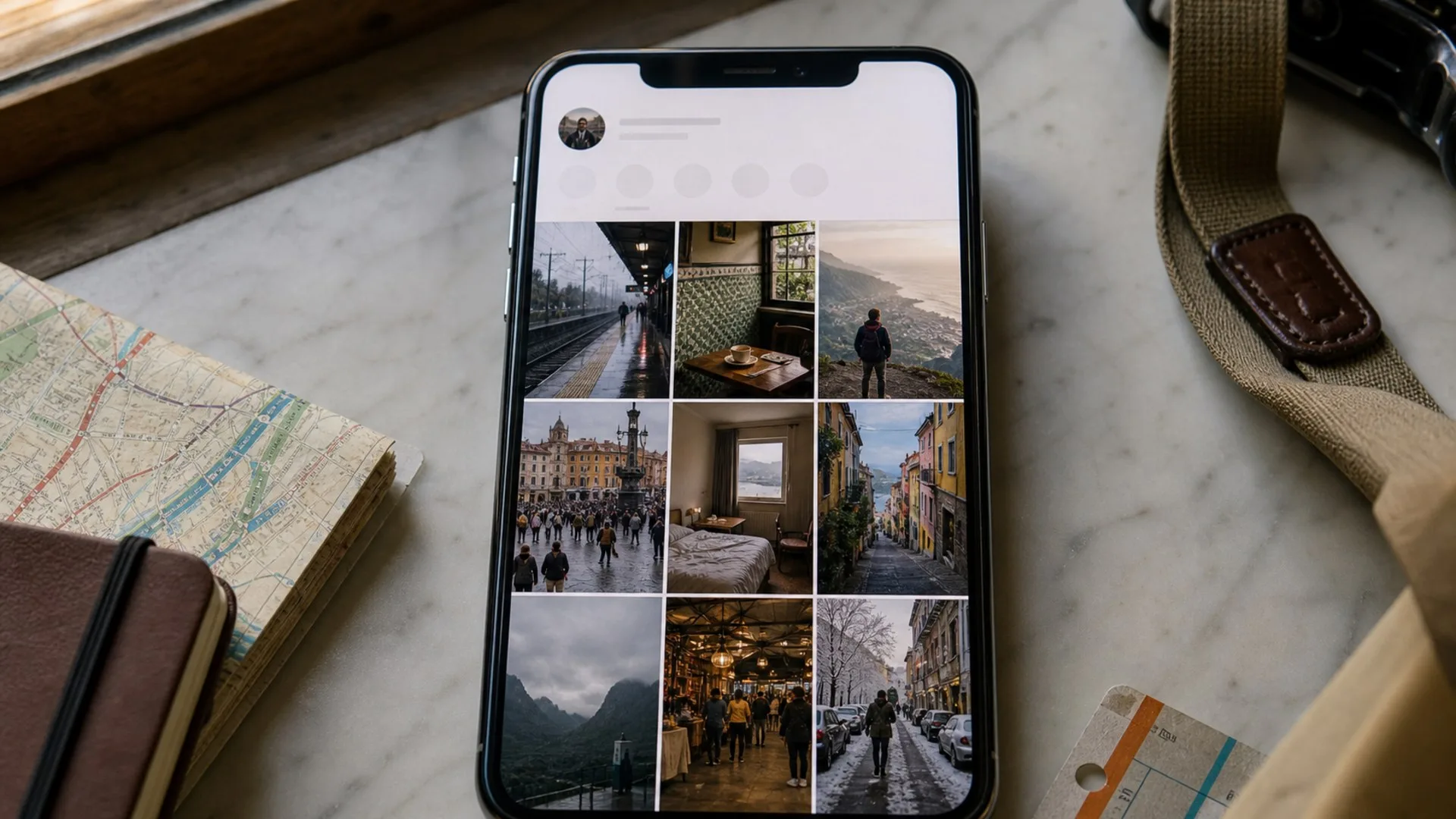
Creating Authentic Travel Content in an Over-Filtered World
Learn which public-facing cues make travel content feel grounded, how far editing and geotags should go, and how to review a post like an outsider before publishing.
Authentic travel content is not raw travel content. It is polished travel content that still lets the place read as itself after the edit. Getty Images said on April 30, 2024 that its VisualGPS research, based on more than 30,000 adults across 25 countries, found 98% of consumers see authentic images and video as pivotal for trust. Adobe's editing guidance reaches the same conclusion from a craft angle: good edits should look natural, basic corrections come first, and subtle adjustments should preserve realism and texture. For travel posts, that means the weather, light, scale, crowd level, and effort behind the frame still need to survive the polish.
That matters because travel choices are increasingly experience-led. McKinsey wrote on September 17, 2024 that travelers increasingly plan trips around activities and that the type of moment they want can influence which destination they choose. Hilton's 2025 trends report adds a practical signal: 74% of travelers want recommendations from locals. A useful travel post, then, cannot stop at mood. It has to help someone understand what the place felt like, who it suits, and what tradeoffs came with the shot.
Why over-filtering makes different places look like the same trip
Over-filtering starts when the preset becomes more memorable than the destination. Adobe says strong photo editing should look natural and preserve realism, so the practical test is not whether a frame was edited. The test is whether the edit leaves enough truth in the scene to keep the post useful. When every sea drifts toward the same cyan, every alley picks up the same warm glaze, every plaza looks quieter than it was, and every hotel room gains the same airy finish, the house style starts doing more descriptive work than the place.
Travel viewers do not need raw files. They need enough place truth left in the frame to make sense of what they are seeing. Wet stone should still read wet. Haze should still read haze. A tight staircase should not become an effortless stroll because the shadows were lifted and the crop erased the incline. Over-filtered travel photos fail because they flatten weather, density, material, and scale into one reusable travel skin.
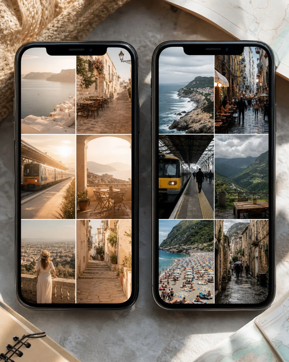
Same stop, two editing logics
Preset-first
the platform is warmed, brightened, cropped empty, and cleaned until rain, crowd density, and station scale almost disappear.
Place-first
the frame is cleaner and easier to read, but wet concrete, cool light, queue pressure, and the compressed platform still tell the viewer what the stop actually felt like.
What "place fidelity" means in practice
Place fidelity means preserving enough of the real conditions for a viewer to understand why one destination feels different from another. That includes positive cues such as clear morning light, open space, and crisp color, but it also includes the less flattering parts that make a destination readable: haze, wet pavement, cramped rooms, midday glare, long lines, or steep approach roads.
If the mood survives but the place disappears, fidelity is gone. Travel content can still be highly styled, but the styling has to support the destination instead of replacing it. That standard works for stills, short-form video, carousels, hotel reviews, and district guides because it asks the same blunt question every time: after the edit, does this place still look like itself?
Make the travel rule visible before you style the footage
A clear travel rule makes polished content feel authored instead of generic. If viewers cannot tell what kind of travel decision your work helps them make, the edit has no serious job beyond atmosphere. McKinsey's experience-first framing matters here: people often choose destinations because of the moment they want, not just the map pin. Your content should make that moment legible through a repeatable lens.
Useful travel rules are concrete:
- stroller-friendly city breaks with honest walking friction
- short-stay hotel reviews where room scale and station access matter
- train-first weekend routes with platform, transfer, and luggage reality included
- shoulder-season neighborhood walks that show weather instead of editing it away
That lens is what stops polished content from becoming interchangeable. If you need to sharpen the editorial throughline first, find a travel angle that does not flatten every destination.
The 10-second stranger test
The fastest audit is simple: give a stranger the first screen of the profile, a few recent posts, and one caption. If they cannot explain who the content helps and what repeatable travel question it answers, the problem is not only color grading. The promise is still too soft.
This test matters even more for small teams. A shared preset can make a mixed account feel coherent, but only a visible travel rule makes it memorable. Fix the rule first. Then let the styling reinforce it.
Edit for clarity, not sameness
The best travel edit corrects capture problems without rewriting what the place felt like. Adobe's guidance is operational: start with exposure, contrast, highlights, shadows, and white balance; keep the changes subtle; then step away and compare before-and-after versions so you do not overedit. That is a better discipline than dragging every destination toward the same cinematic finish.
Travel posts often need help because the camera missed what the eye handled easily. Haze can mute depth. Mixed indoor light can skew color. A fast handheld frame can exaggerate darkness or tilt lines that felt stable in person. Fix those issues first. What you should not do is solve every problem with the same warmth, the same crowd-minimizing crop, and the same texture smoothing.
Four edit fixes and the red flags that come with them
Too dark or washed out: correct exposure and recover highlights or shadows. Red flag: pushing brightness until the weather stops reading honestly.Color feels off because of mixed light: correct white balance so surfaces look natural. Red flag: warming every scene into the same sunset-like palette.The composition feels cramped: crop or straighten for readability. Red flag: cropping out scale cues that tell the viewer how tight the room or street really is.Texture looks dull: add modest contrast and detail. Red flag: smoothing stone, skin, fog, or fabric until the frame feels plastic.
A simple edit stack that keeps light, color, and scale honest
Use the same order every time. First fix exposure so the scene is readable. Then correct white balance so stone, sea, skin, and sky stop fighting each other. Next adjust contrast just enough to restore shape. Straighten perspective if lines are distracting. Crop only after that, because many misleading edits start with a crop that deletes density or makes a space feel larger than it is.
Finish with a before-and-after pause. Adobe explicitly recommends stepping away and checking comparisons, and that habit matters more than any preset. If the room still feels compact, the hill still feels steep, and the weather still feels true, the edit probably landed. If every destination starts looking like it belongs to the same weather system, stop.
Put the missing conditions back in the caption
Captions often do more authenticity work than the image itself. A polished frame removes friction by design: queues sit outside the crop, wind barely reads, stairs compress, and distance flattens effort. The caption is where you restore those missing conditions. That is also where Hilton's local-recommendation signal becomes useful. People want orientation from someone who has been there, not another mood-only sentence about how magical the stop felt.
What belongs in the caption is the practical context that shaped the image: when you arrived, why the square looked empty, whether the view required a long climb, how noisy the cafe became after noon, whether the room felt small but efficient, or why the beach looked calm because the wind had not picked up yet. McKinsey's travel research notes that experiences influence destination choice. The post becomes more trustworthy when the caption explains the conditions behind the experience instead of pretending the frame is self-explanatory.
The details that make a polished shot actually useful
Useful travel captions answer "what shaped this?" before they answer "was it beautiful?" The details that matter most usually fall into a few buckets:
- timing: first ferry, late-afternoon shade, weekday quiet, rain just passed
- effort: stairs, loose gravel, long platform transfer, uphill walk, family-friendliness
- comfort: noise, heat, seating, queue length, room size, shelter
- tradeoffs: stronger view but harder access, better breakfast but longer commute, cheaper rate but thinner walls
- etiquette: permission, dress expectations, or behavior that keeps people and places respected
Adobe's travel-photography guidance also makes the people side explicit: respect local customs, talk to people, and ask permission if you want their photo. That is part of authenticity too. A polished travel image gains trust when it carries the conditions, tradeoffs, and human context that the lens alone cannot hold.
Choose location precision deliberately
Location detail is authentic when it improves honest orientation, not when it turns a post into a copyable route. Exact naming helps when the post covers a clearly public venue such as a museum, a station, a hotel, or a marked access point where specificity reduces confusion. Broad naming is better when the real value is district character, timing, or atmosphere. Withholding detail is reasonable when precision would mainly function as instructions or imply a level of certainty the post does not actually support.
This is where a lot of polished travel content slips. A scenic frame can look casual, while the label quietly does heavy routing work. If you want a deeper breakdown of that publishing decision, use a more intentional location-tagging rule.
Location precision choices
- `Exact`
use for public venues where the name helps orientation, such as a station, museum, or hotel. Good question: "Does exactness make this easier to understand?"
- `Broad`
use for districts, coastlines, neighborhoods, or walking zones where atmosphere matters more than a pin. Good question: "Is the area the real subject here?"
Exact, broad, or withheld
The right label depends on what the post is helping the reader do. If you are reviewing a public museum with timed entry, exact is useful. If you are explaining why the north side of a neighborhood works better in the morning, broad is enough. If the frame is really about a quiet cove at the end of an easy-to-miss turn, withholding detail can be the more honest choice because the post is sharing an impression, not publishing route instructions.
Label for understanding first. Precision should earn its place.
Run one outsider audit before you publish
Authenticity is a publishing discipline, not a single-post aesthetic choice. One careful post can still feel misleading when it sits beside five recent uploads that use the same warmth, the same empty-frame crop, and the same vague caption language. The final review has to happen at profile scale, because that is how a first-time viewer will actually encounter the work.
This is also the last place to catch silent mismatches. A caption may sound practical while the surrounding posts promise pure escapism. A location label may look too exact once you read the rest of the context. A technically good edit may still flatten the destination if the surrounding batch already made every place feel like the same trip.
A five-point pre-publish checklist
Outsider audit
- the travel rule is visible within a few seconds
- the place still looks like itself after the edit
- the caption restores the conditions that shaped the frame
- the location label is only as precise as the post can honestly support
- the surrounding posts do not quietly turn this stop into a different claim
If a stranger can understand the place without mistaking the style for the destination, publish it.
Common questions
FAQ
Is authentic travel content the same as unedited travel content?
No. Authentic travel content can be polished. The line is whether the edit clarifies the capture or rewrites the place. If weather, scale, color, or crowd conditions stop feeling believable, polish has crossed into sameness.
Can luxury travel posts still feel authentic?
Yes. Luxury framing loses trust only when mood replaces orientation. Keep access, timing, room scale, service conditions, and tradeoffs visible enough that the audience can still understand what the stay actually offers.
What should a caption add to a polished shot?
Add the conditions that shaped the frame: arrival time, queue length, weather shift, walking effort, noise, booking friction, etiquette, or who the stop suits. That context makes the image useful instead of just attractive.
Should every scenic post use an exact location?
No. Use exact, broad, or withheld detail based on the reader task. Exact works for public venues, broad works for atmosphere or district-level guidance, and withheld works when precision would mainly make the visit easy to copy rather than easier to understand.
Read next
Continue with adjacent articles that support the same public-viewing workflow.
discoveries
How Social Media Changed the Way We Travel Forever
See how public bios, recent posts, stories, highlights, captions, and location choices now shape destination discovery and trip expectations, with clear limits on what public content can confirm.
guides
How Travel Creators Are Changing the Way We Explore the World
See how travel creators shape destination discovery through bios, repeatable post patterns, captions, highlights, geotags, and a quick usefulness audit.
discoveries
Why Local Travel Content Is Outperforming Luxury Destinations
Identify the cues that make local travel content more useful than luxury mood shots, with a simple audit for bios, highlights, captions, and trip logic.